Balance, strength, courage
Dharma, from the Mahabharata: the idea of holding to what is right when it would be easier not to. Three qualities out of that text sat behind the drawing — balance, strength, courage. It is an unlikely brief for a bar unit, and it turned out to be a useful one, because each quality translates into something physical. Balance is proportion. Strength is how the piece is built. Courage is the willingness to leave a form plain when decoration would have been safer.
The form itself is modern Scandinavian: quiet lines, honest timber, nothing applied.
The brief
Our client wanted a bar in a room that also has to be a living room every other day of the week. That is the constraint the whole piece comes out of: it had to be genuinely usable when open, and disappear into the wall when closed. A bar that reads as a bar all week makes a living room feel like a lounge.
They also wanted it to sit beside pieces they already owned, which set the timber and the finish before we drew a line.
Four decisions
It closes flat
No handles standing proud, no glass front announcing bottles. Closed, it is a cabinet with a clean face; the doors close flush, so nothing protrudes into a walkway. This is the decision that makes the piece live in a family room.
Balance, not symmetry
The interior is divided unevenly — bottles need height, glasses need less, and a working surface needs more room than either. Two masses of different widths, held level by a single horizontal line across the front. Symmetry would have wasted a third of the volume.
Strength where the weight is
A bar unit carries more weight per square foot than almost anything else in a house, all of it glass and liquid, and it is opened and closed daily. The carcass is built to take that, with a working shelf thick enough not to bow across its span. Bar units fail at the shelf and the hinge, so both were over-specified deliberately.
Plain, at the client's risk and ours
The first sketch carried a detail across the doors. We removed it. What is left is proportion, grain and a shadow line — which means the piece has nowhere to hide if the proportion is wrong. That is the courage part, and it is why the drawing went through several rounds before anyone was happy.
Materials, named
The carcass and visible timber, the finish, the interior surfaces and the fittings were all chosen as samples. The interior was chosen to wipe clean, because a bar interior takes spills and gets wiped more often than it gets admired.
Every one of those was selected from the library at Gachibowli with the client's hands on the samples, and every one is written into the specification by name and code — which is how we could build a second one tomorrow.
The making
Cut and jointed on our own floor in Hyderabad. On a piece with no decoration, the joinery is the finish — a joint that would disappear under a moulding has nowhere to go here, so the fit was checked dry before anything was glued. The doors were hung, adjusted, taken off, and hung again to get an even shadow line across the closed face.
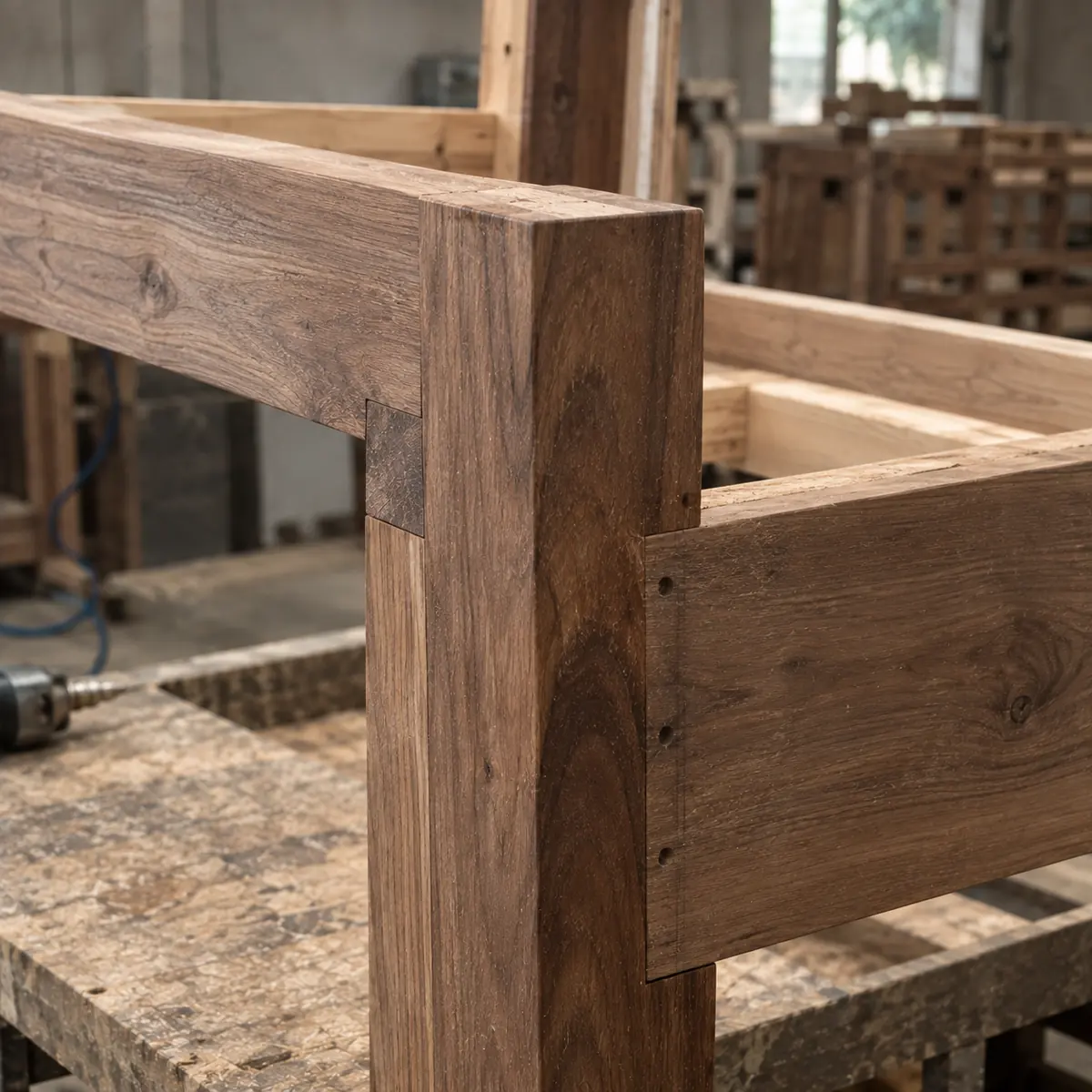
Finishing last, in daylight, because a plain timber front shows every variation in sheen. Then it was measured against the drawing and photographed before it was wrapped.
The finished piece
In the room, closed, it reads as timber against the wall — and most visitors do not know it is a bar until it is opened. Open, the working surface sits at a height you can actually pour at without stooping.
It is one piece, in one room, drawn to one wall. If yours is a different wall, that is the point. Bring photographs and we will draw to it.